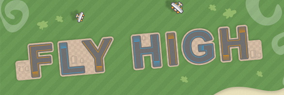
This tutorial will show you how to create an airport runway style text effect similar to the popular mobile game Flight Control for iPhone and Android using Adobe Illustrator.
We will be working towards the final image below. The tutorial makes use of Illustrators basic features like Fills, Strokes, Patterns and the Pathfinder and Appearance panel.

STEP 1 BACKGROUND
Create a new Illustrator document. The one used in this tutorial is a landscape A4, 297 by 210 mm.
Draw some curvy lines just below the center of the Artboard with the Pen Tool and close the shape outside the Artboard. Fill this shape with a green grassy color or pattern. Now press Ctrl+C to copy the shape and Ctrl+B to paste the copy behind the original. Now use the Move Tool or the arrow keys to move the copy down and to the right slightly so that it shows up behind the grass shape. Fill this shape with a yellow sand like color or gradient.
Press Ctrl+C and Ctrl+B again to create another copy behind the sand shape and move this one down as well, but this time a little to the left. Fill the shape with a deep blue color or gradient. Repeat these steps to create a final shape below to fill the entire Artboard and fill this shape with a slightly different shade of blue.
To create a little more depth select the sand shape and go to the Appearance panel. Click the small fx-icon at the bottom and select Stylize > Drop Shadow… Play around with the setting until you are happy with the effect. The same can be done with the grass shape.

This method of Copy and Paste in Back is the quick and easy way to create the landscape background. If you want more variation use the Pen Tool to draw a new shape for each layer and use Ctrl+[ to send the new shape behind the old one.
STEP 2 TEXT
Double Click Layer 1 and change its name to “Landscape”. Click OK and create a new layer above. Name this layer “Type” and Lock the Landscape layer.
The effect works best with straight edges so choose a sans serif font for your main text. In this tutorial the font used is Arial Bold at 125 pt. Because the effect extends beyond the base shape of the letters, to allow for this the tracking (space between letters) needs to be increased, in this case to about 100.
Because this effect is not a dynamic one, make sure you are happy about your text before you continue. After the next step the text can not be changed without starting over.
Select the text shape, Right Click and choose Create Outlines.

STEP 3 RUNWAY
Select the text and choose a dark grey for the Fill and Stroke. Go to the Stroke panel and change the Stroke Weight to 8 pt. Make sure Round Caps and Round Joins are selected (immediately below Weight in the Stroke panel). Align Stroke to Center should be set by default.

STEP 4 AIRPORT BACKGROUND
Select the text and press Ctrl+C and Ctrl+B to create a copy behind the original. Change its Fill and Stroke to a light brown color or pattern and increase the Stroke Weight to 16 pt.
Go to the Layers panel, expand the Type layer and Toggle Visibility Off for the grey text on top in order to better see what you’re doing.
Select the visible bottom text and go to Object > Path > Outline Stroke.
Draw some random shapes using the Rounded Rectangle Tool. While drawing the shape use the up arrow to increase and the down arrow to decrease the corner radius to fit the corners of the lettershapes. Position the shapes against, behind or inbetween the lettershapes to create some areas for airport structures (to be added later on in this tutorial).
Make sure all the new shapes are directly above the text shape (and below the invisible grey text) and select all of them. Go to the Pathfinder panel and choose Unite to unite all the shapes into one.

STEP 5 COLORED RUNWAY LINES
Go to the Layers panel and Toggle Visibility Off for the background text shape and Toggle Visibility On for the grey text above. Select the grey text and press Ctrl+C and Ctrl+F to create a copy in front.
With the text still selected change its Fill to none and its Stroke to a nice bright color. Change the Stroke Weight to 1 pt and make sure Butt Caps, Round Joins and Align Stroke to Center are selected.
Lock the brown and grey text shapes in the Layers panel and select the colored text. Right Click and choose Ungroup to create separate lettershapes. You can apply different colors to each lettershape like in the example below.

STEP 6 CREATE LANDING STRIP
Zoom in on the first letter and with the Direct Selection Tool (the white arrow) click on the line segment at the bottom of the F and press Delete. Select the two open-ended anchor points and move them upwards with the up arrow key. Count the number of taps you think is needed between each line of the landing strip and multiply that number by four.
In this tutorial the number of taps was 4 between each line. However keyboard increments can be different on each system so you need to test this yourself!
Select the Line Segment Tool and draw a new line in the same place as the line you deleted at the bottom of the F. You should be able to snap to the anchor points of the locked grey text shape beneath. If the new line jumps right after you draw it make sure Align to Pixel Grid is turned Off in the Transform panel. Snap the end points back to the anchor points beneath so it sits exactly where the F used to finish at the bottom.
With the line segment selected press Ctrl+C and Ctrl+F to create a copy in front. Remember the number of taps and move the copied line with the up arrow key. Press Ctrl+C and Ctrl+F again to create another copy and move this one up the same number of taps. Repeat this one more time to create the fourth and final line of the landing strip.
Change the Stroke Weight of the lines from thin to thick from the bottom to the top. The Stroke Weights used in this tutorial are 0,75pt – 1pt – 1,5pt – 2pt.
Deselect everything by pressing Shift+Ctrl+A and with the Direct Selection Tool select and delete the lines on the right side of the F.

STEP 7 REPEAT STEP 6
Repeat the previous step until all the lettershapes have a landing strip. The letter H can have two landing strips and for the letter G the easiest place to put the strip is the horizontal part in the center.
The text effect works best on straight edges because an angled edge (like the top part of the letter Y) can be difficult to match using the Rotate Tool.

STEP 8 FINISHING TOUCHES
With the main text effect complete this step covers some of the options to finish up the final image with some additional elements.
Unlock and select the brown background text shape and add a subtle Drop Shadow in the Appearance panel.
To keep your document organized create a new layer above and name it “Extras” (or something).
Draw some curly cloud shapes with the Paintbrush Tool, change the Fill to white and the Stroke to none. In the Appearance panel click on Opacity and change the Opacity setting to something between 25 and 50 percent.
Again with the Paintbrush Tool draw some random shrubs and tree shapes and change their Fill to a light green color or gradient.
Use the Rounded Rectangle Tool and the Ellipse Tool to create some airport structures to put on the brown areas around the lettershapes. Copy the shapes behind and Unite them. Change the Fill and Stroke color to a light grey and set the Opacity setting to the Multiply Blend Mode. Move the shape a little to the left and up to create a simple shadow.
Draw or Import some airplane graphics and play with the shadows to create some more depth and your airport runway text effect is complete! Check out the final result below.
A pdf version of this tutorial can be downloaded here. If you’d like to share this tutorial, please link back to this page. Thanks!


